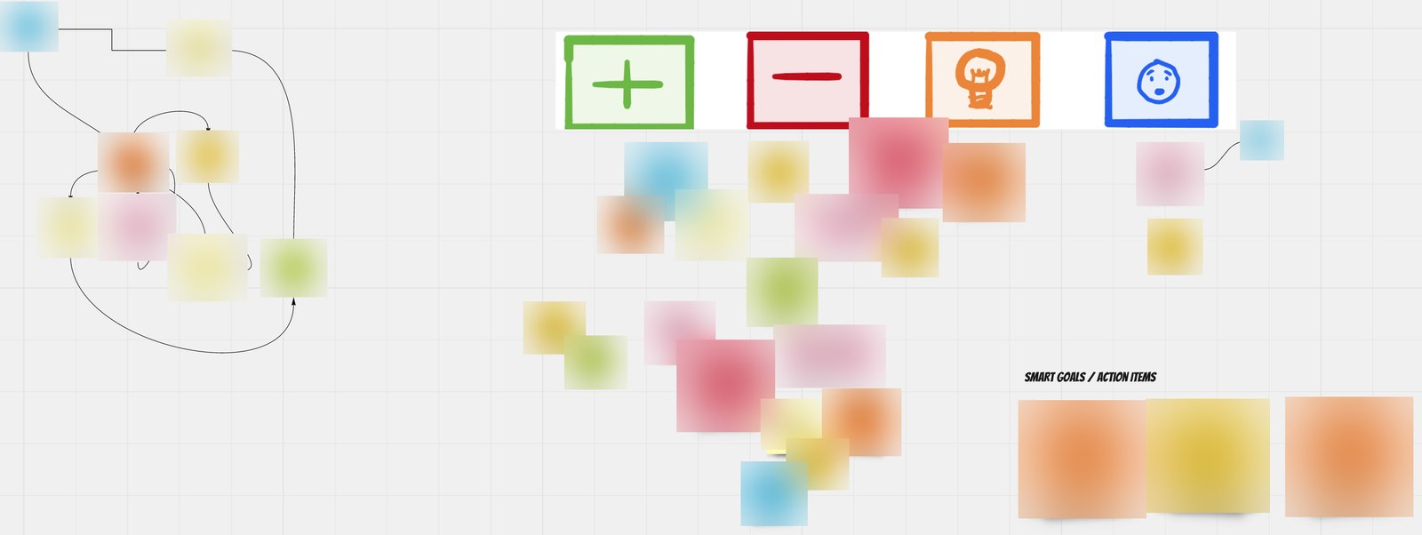

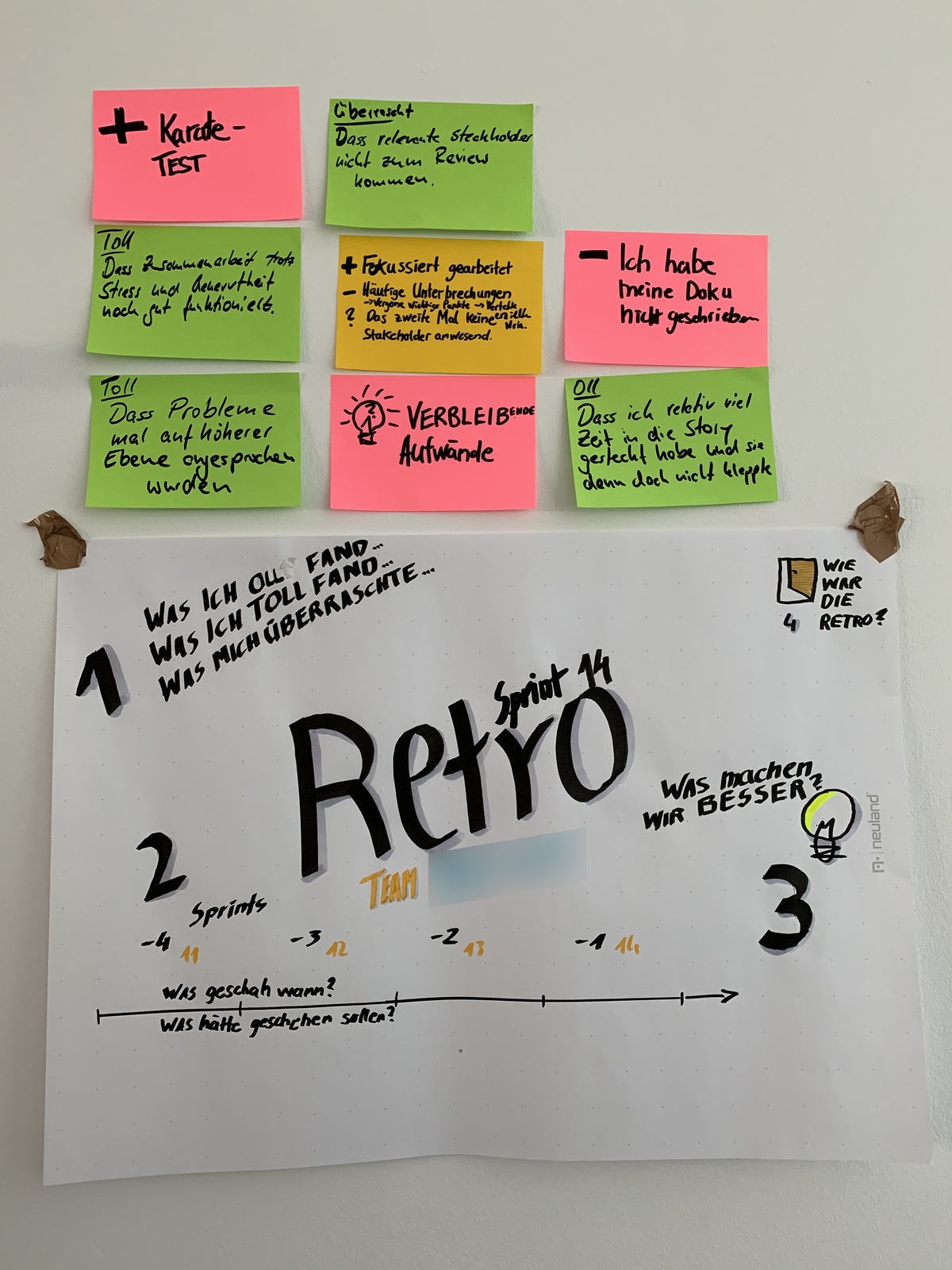
I keep experimenting with layouts for retrospectives. Here are two versions, on paper and on screen. Both leave room to look back and decide what to improve.
The paper version groups prompts around a central title: what went well, what did not, what was surprising, and what to improve. A timeline adds two useful questions: what happened when, and what should have happened?
On screen, the layout spreads out horizontally, with four symbols marking the categories. SMART goals and action items get their own area below. I still want to follow up on those actions at the next retrospective. Giving them a separate area makes room for that alongside the discussion.