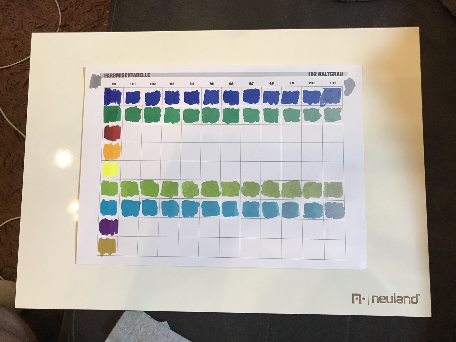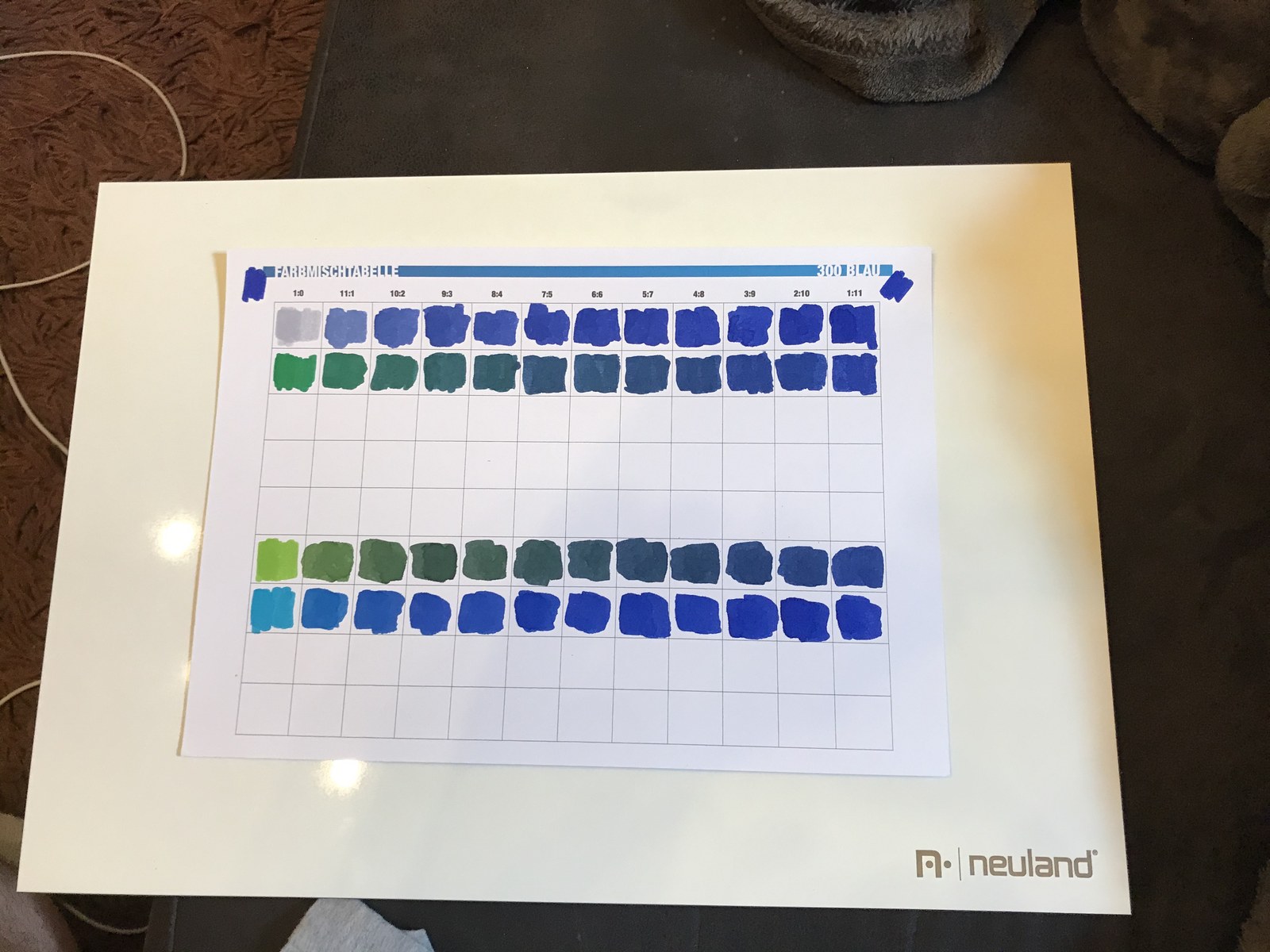

Having plenty of marker colors is one thing. Having the right ones is another. At paydirekt, I wanted to mix the company’s corporate design colors for my visual facilitation work.
I had already used the corporate design when renovating the Scrum boards. Now I wanted to get the inks closer to that palette. So I started mixing, using printed tables to record the ratios and paint a sample of each mixture.
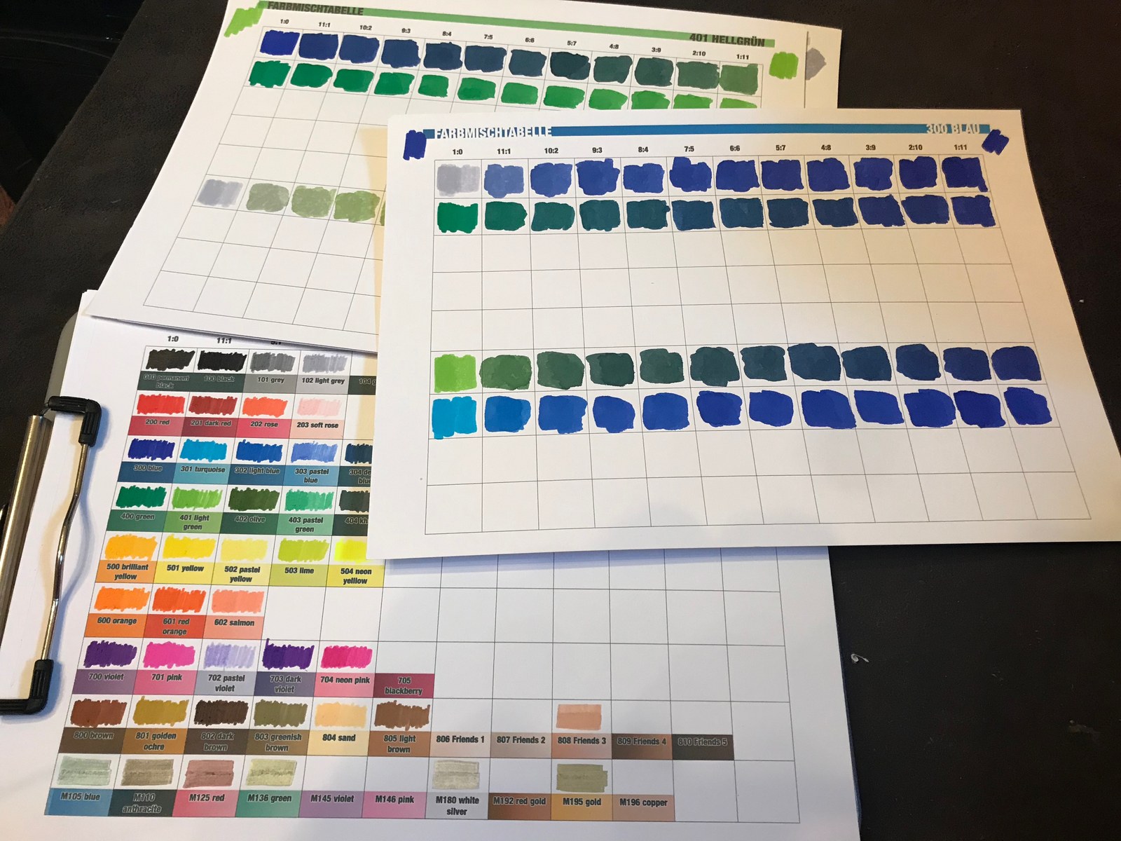
With the swatches side by side, I could compare the shades and keep track of how I had mixed them. My desk was starting to look more like a small ink laboratory than a place for lettering practice.
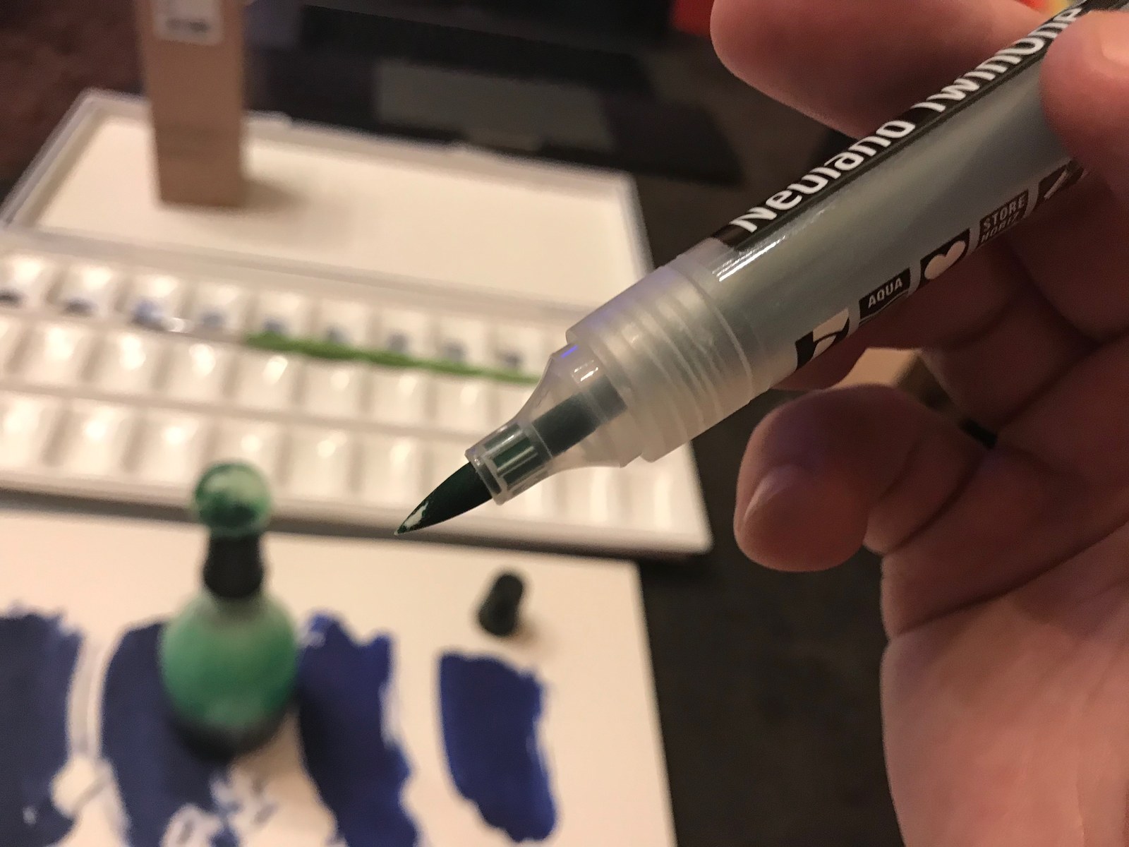
The blue and green mixtures filled quite a few little rectangles. Finding a nice blue would have been easy enough. Finding the blue I was aiming for was the point of the exercise.