
Zachary Johnson and Paul Hayes showed some really nice examples of the CSS 2D transformation capabilites (isocube, 3D isocube using 2D CSS).
What I missed was the math behind it. Both (and every other isocube I could find on the net) statically positioned the three rectangles that form the isocube.
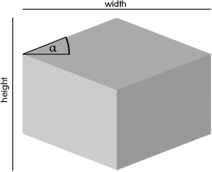
So what I did was to implement a generic isocube that renders based on the dimensions w, h and a degree α. The sources can be downloaded as a jQuery Plugin.
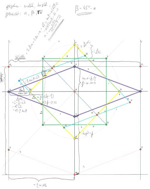
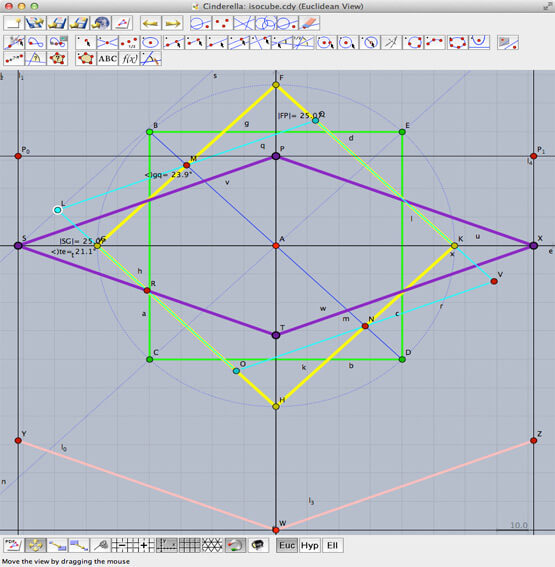
The math is mainly based on the Pythagorean theorem. In order to geometrically verify some hypotheses that came up I used Cinderella.
Examples
Different Angles
Interactivity
Usage
HTML
<div class="example1"></div>

<div class="example2">
  <a href="index.html">Homepage</a>
</div>

<div class="example3">
  <div class="right face">
    <a href="index.html">Homepage</a>
  </div>
</div>

<div class="example4" data-alpha="30" data-shadow="true">
  <div class="left face">left face</div>
  <div class="right face">right face</div>
  <div class="top face">top face</div>
</div>
JS
$(".example1").isocube();
$(".example2").isocube({ alpha: 20 });
$(".example3").isocube({ shadow: true });
$(".example4").isocube();
Download
You can download the current release of isocube on github.com/bkahlert/isocube.
Important: You also have to install the jQuery Plugin jQuery 2d Transform as isocube uses it for cross browser support.
Maths
If you’re interested in the underlaying calculations, here you go.